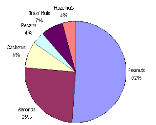
Pie charts are a very common type of map. They convey what percentage of the whole a certain object is by giving that item their own "slice" of the pie; the slice size is representative of the percentage that object accounts for. For example, in this image almonds make up 25% of the nuts in the bag and the slice it receives is one fourth of the pie. Pie charts initiated the movement away from recording data into rows or columns and establishing what is known today as geovisualization.
No comments:
Post a Comment