Saturday, March 31, 2012
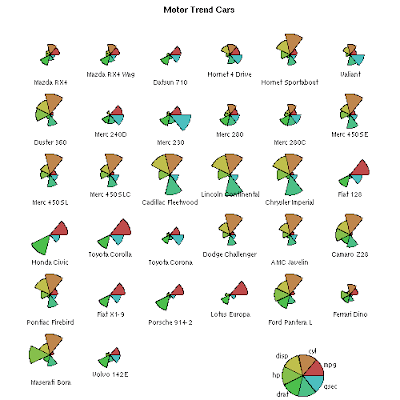
StarPlots
Histogram

Histograms display statistical information by using rectangles to show the frequency of data items in successive numerical intervals of equal size. In this example, each colored rectangle represents the scores received by students on their final. The red shows 3 students scoring anywhere from 0-20, while the purple rectangle shows that 9 students scored anywhere from 20-40. These maps are easy to use and can be very helpful when trying to explain statistics.
Box Plot

A box plot, or box and whisker diagram provides a simple graphical summary of a set of data. Typically this graph is based on a five number summary including: minimum, first quartile, median, third quartile, and maximum as shown in this example. This graph is very convenient for the viewer because it provides a lot of information with minimum effort required from the reader.
Scatterplot

Scatterplot graphs are used to present measurements of two or more variables. The points are plotted, not joined, and the resulting pattern indicates the type and strength of the relationship between the variables. The bold line that crosses the middle of the graph is known as the trend line. This line tells the reader what kind of relationship the variables have. For example, this map has a positive correlation and the line shows that by running from the lower left corner to the upper right corner.
Friday, March 30, 2012
Stem and Leaf Plot

The map shown above is a Stem and Leaf Plot. The number on the left side of the divider line is known as the "Stem" while the number on the right is called the "Leaf". Each stem is displayed only once, while the leaf my be listed numerous times depending on the information provided. These plots are generally used to display items such as test scores or age, and are especially useful because it gives the viewer a quick representation of the distribution and density of the data.
Subscribe to:
Comments (Atom)